Interior Design Mistakes You Might Not Know You’re Making
We are all bound to make interior design mistakes at some point in our life. Playing around with accessories, color and scale is how we learn what we love and what works best in our home. More than anything, the goal of interior design is to help home dwellers live healthier and more productive lives. Try to avoid these seven common design mistakes!
Stale Accessories
The most fun and least expensive way to refresh your interior is through accessories! Art, rugs, pillows, and other accessories all give your space a quick and easy face-lift. It is also a great approach to adding texture, patterns, and color to your space. Try to avoid using accessories that are lackluster or uninspiring. Examples include: pillows that are the same color as your sofa and accents that are all the same size, color or shape. Use accessories to bring life to your home!
Bonus design tip: You can also swap out accessories seasonally throughout your home. Add festive place settings in your dining room. Consider changing out the pillows on your sofa to bring holiday cheer. Or, place fresh spring flowers on your entry table.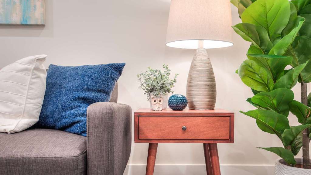
Budget Shopping
We all love a deal, but we discourage you from purchasing a 15-piece coordinated set of furnishings simply because they are $599. A much better option (in the long run) is to purchase 1 or 2 of the highest quality pieces you can afford. Then, build upon them over time. For instance, purchase a well-made sofa first since it will be used most often. Then add additional pieces as you can afford them to bring everything together.
Purchasing high quality, well-built staple furniture pieces will save you money in the end since they will last much longer. Save your budget shopping for smaller accessories and decor items that you might want to swap out over time. In the short term, you may have some bare spots here and there but the end result will make it all worth the wait.
Not Following Trends
We do agree that not every trend should be followed, especially if it is a costly update that will be “out” the next season. However, incorporating an accessory in a trendy new pattern or finish can certainly take a room from ‘drab and dry’ to ‘fresh and updated’ with minimal cost and effort. Don’t be afraid to purchase a mirror with mixed metals or a chevron-patterned rug for your living room as these additions to your space will make a major impact while staying on trend.
Your walls are another fantastic way to incorporate trendy colors and patterns into your home. Try putting wallpaper in your powder room in the latest pattern or painting the wall behind your sofa in the “color of the year”. Incorporating these updates while also bringing in new accessories will completely transform your space into the “now” but can easily be changed in a few years to follow the latest trend.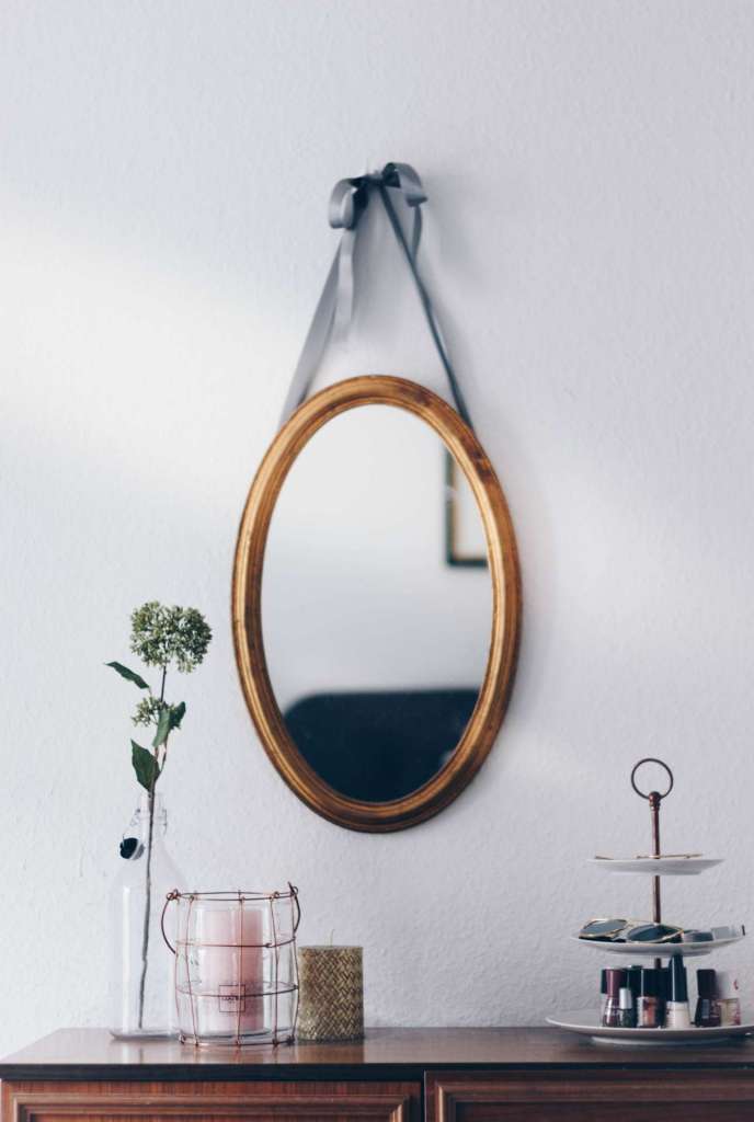
Incorrect Art Placement
When it comes to art, the subject matter is subjective. Hanging your artwork, however, is not. There are some rules of thumb to consider:
- Art should be hung so that the midpoint of the piece is somewhere between 57-60 inches from the floor so it is at eye-level. If you are a petite bunch, err on the lower side of that range.
- Gallery walls are a fantastic way to display all of your framed pieces that look plain silly floating all by themselves on a wall. They should also be hung between 57-60 inches from the floor using the center of the entire grouping as the midpoint. Also, each frame should be at least 2 inches apart from one another.
- If you are lucky enough to have extremely high ceilings, celebrate your space with a giant show stopper piece of art. Your space can handle it! In this case, the midpoint rule might not make the most sense so use your own judgment based on your ceiling and artwork heights.
- Art hung over a sofa or headboard should be at least 8 inches above the back of the furniture piece. It should also span about two-thirds of the width of the sofa or headboard.
Bonus design tip: Refine your gallery wall collection by using matching frames and/or a subject matter with a certain theme. Or mix it up! Our favorite gallery walls feature mixed-media such as objects, art, postcards, mirrors, etc.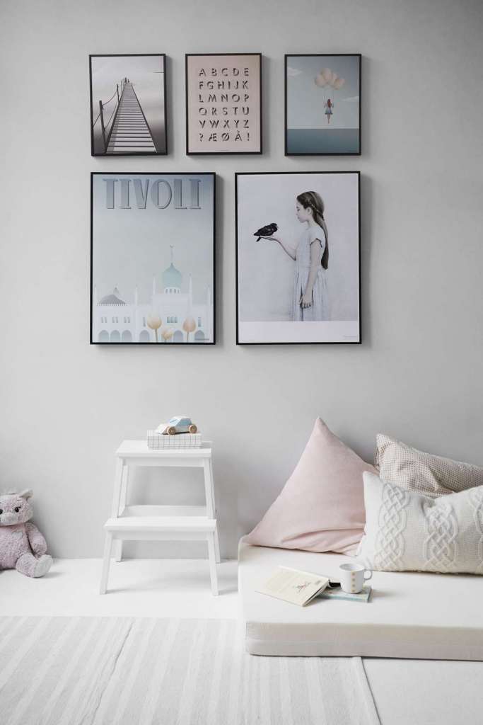
Trying to DIY Every Project
In today’s world, we know that HGTV, magazines, online blogs, and even YouTube make home improvement look so easy! This may be the case if you are painting, changing out your door hardware or installing wallpaper but even these improvements might be better accomplished with a professional. Think about what happens when you apply the incorrect type of paint to your walls, purchase the wrong size door hinges or have trouble matching up the wallpaper pattern with the second strip? A skilled professional will certainly save you time, money, and heartache by having things done correctly the first time. If you are a brave soul and are still determined to DIY, we do urge you to please call in a professional when it comes to things like plumbing, heating, electrical, structural work, and any other improvements that could cause severe harm to you or your home if handled incorrectly.
Insufficient Lighting
Proper lighting is immensely important as it can impact how you feel in a space. Think of lighting as an overall scheme rather than individual lights. You need all of the pieces or layers in order to provide sufficient lighting throughout your home. A well-lit home has three basic types of lighting that you should incorporate: ambient, task, and accent lighting.
Ambient lighting provides a general or overall glow to your space. It is important in every room as it allows you to see and move around the room comfortably. Examples are recessed, chandeliers, flush-mount, track lights, floor lamps, and table lamps.
Task lighting is more localized as it helps you see whatever task you are trying to accomplish. It should be bright with little glare and shadows. As you get older, brighter task lighting becomes even more important. Depending on the task, your ambient light sources may be sufficient in providing enough light. However, tasks such as completing homework, cooking, and reading might be better served using desk lamps, under cabinet lighting, and bedside table lamps, respectively.
Accent lighting provides a focal point and is used to draw attention to a certain feature in your home. It can illuminate your fireplace, a piece of art or architectural feature as a few examples. The light should effectively illuminate the object you are trying to feature without bringing too much attention to the light source itself. This can be accomplished via recessed lights, spotlights, rope lighting in coves, sconces, and other light sources.
Not Enough Green(ery)
Plants quite literally bring life into your space. They clean the air, promote a sense of calm, and improve your overall well-being. You don’t have to turn your home into a greenhouse to reap the benefits but a well-placed plant, tree or even fresh flowers are worth the minimal effort of water and sunlight!
Bonus design tip: Have trouble sleeping? Try placing jasmine, lavender or an aloe vera plant in your bedroom. These plants can lower your stress levels, heart rate, and blood pressure allowing for a more restful night’s sleep.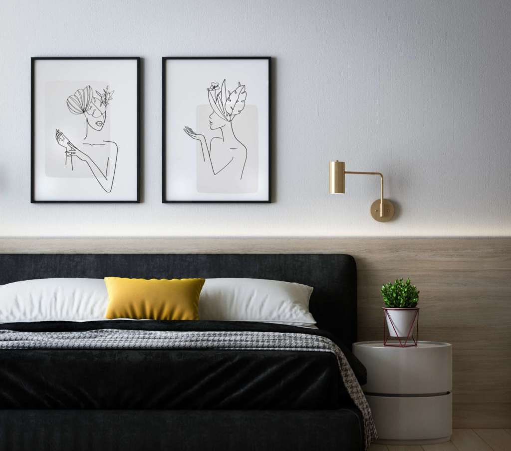
Final Thoughts
Correcting just one of these design errors can update your home with minimal effort or expense all while giving you a healthier home. Go ahead and give it a try!
And (as always) Happy Designing!
This article originally appeared on SassMagazine.com.
Need design assistance? Begin your own design journey with Beyond the Box Interiors.

