Psychological Effects of Color in Interior Design
Color. There is an endless number of choices with just as many emotions and there are significant psychological effects of color in interior design. Colors affect people and that is why we react to them in a certain way. You either love, hate, or are indifferent to a color. The greater the impact of a color on a person’s mind, the more they will love or hate that specific color. This is why we use such terms as ‘harsh,’ ‘loud,’ ‘soothing,’ ‘lively’ or ‘mellow’ to describe colors. But think about it, how can color be loud when they do not make any sounds?
When people use these words to describe a color, what they are really trying to do is express a sensation that is beyond what can be felt with our five senses. The words are an attempt to explain how the color registers on the mind and the message it communicates to the brain. Colors have a psychological effect that can stimulate, dampen, calm, or irritate people.
This understanding is important when choosing the colors we use in our homes and businesses. The colors we select for the walls and décor can hinder or advance the activities that are performed in a room, explains Dawson Property Management. They can set people in the right state of mind to function effectively in the room or they can impede their ability to be successful. This is because, even when we don’t realize it, colors are always affecting us.
This effect can be positive, negative, or neutral. In interior design, it is important to be aware of the exact effect the colors we have in a room are creating or we may find that people are reacting to a room’s colors in a way that is opposite to what we are expecting. Understanding color psychology is critical to designing a space effectively. So, how do different colors affect people’s moods?
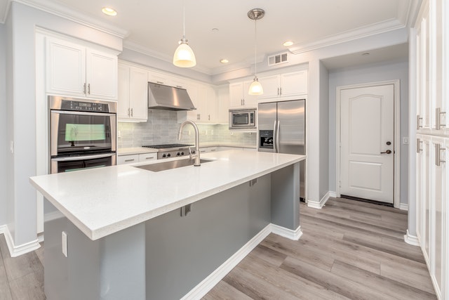
White
White aids clear and organized thinking, it promotes clarity because it presents a blank canvas without distracting elements. It is also the color of innocence, perfection, and cleanliness. Because it creates the illusion of space, white is used to make small rooms feel larger. It also makes rooms feel bright and airy. One concern with using white is that for some people it feels bland so it is important to select the correct shade of white with the proper undertones to elicit the psychological response you are trying to achieve.
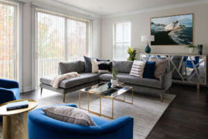
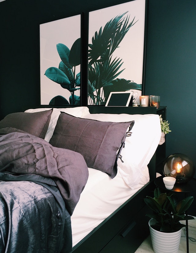
Black
Black creates depth that is mysterious and strong-willed. It is subtlety and conservatively elegant. It is associated with quiet power and sophistication. Black imparts understated class and dignity to a room. However, painting the whole wall in black can make it intimidating or even gloomy. It is usually best used in small amounts, along with complementary colors.
Green
Green is the color of nature: vitality, growth, and fertility. Green is usually associated with birth, spring, renewal, and beginnings. A green room creates the same relaxing effect as a forest environment, it puts the emotions in a state of balance. Green is one of the few colors that can be used in any space. It works equally well in the office, bedroom, or living room.
Red
Red is the color of warmth and passion. Being in a red room causes spikes in energy levels and makes people more alert. This is why red is associated with power, war, and danger. Because it is so stimulating, red is great for grabbing attention. This makes it perfect for entryways and front doors. Red, however, must be used carefully because it can be over-powering.
Yellow
Like red, yellow is energizing, but the energy of yellow is different. Yellow makes people more excitable. People inside yellow rooms tend to be emotional, more conversational, and likely to express their opinions freely. Like white, it also makes rooms airy and brighter. However, since it provokes excitability, yellow can make people cowardly or prone to anger so be cautious where you use it in your home.
Orange
Orange is a mixture of yellow and red. It combines the best qualities of both colors to varying degrees. Orange is stimulating to the emotions but with the intensity of red. Unlike yellow, orange boost emotions without pushing people to extremes. The energy of orange tends more toward the positive, this is why this color has a healing effect.
Blue
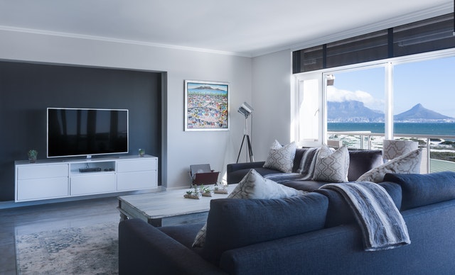
Blue is calm and soothing. It is the color of confident trust and wisdom. It has the opposite effect on the roaring energy of red. Blue lowers heart and breathing rates as well as blood pressure. Like blue skies, blue rooms suggest stability and induce feelings of serenity and peace. This is why blue is a perfect color for rooms where people relax, such as bedrooms and bathrooms.
Purple
Purple is luxurious; it is associated with creativity and royalty. The color evokes feelings of calm, wisdom, and mystery. Used in the right way, purple makes rooms feel luxuriant and rich. It is a great color to incorporate into throw pillows and décor. Purple also makes a great accent color for kid’s rooms as children in purple rooms tend to become more imaginative.
Choose your Color Story Wisely
Color, as you can see, affects us in so many ways. In addition, different shades of the same color can have varying effects on one’s mind and sub-tones can also introduce their own effect into the mix. Choose your color story wisely and just know that your surroundings definitely have an effect on your mind and overall health. The most important factor when choosing colors should be that they evoke an overall positive emotion.
And (as always) Happy Designing!
Thank you to our guest blogger Joey Hayes from Dawson Property Management
Need design assistance? Begin your own design journey with Beyond the Box Interiors.